
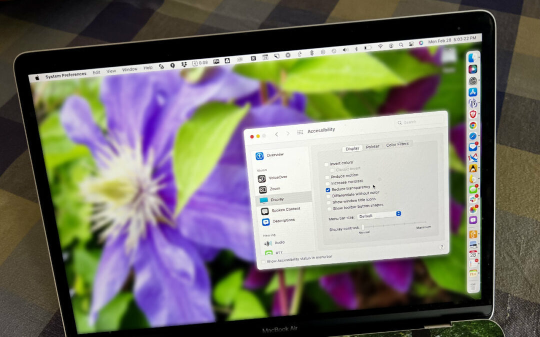
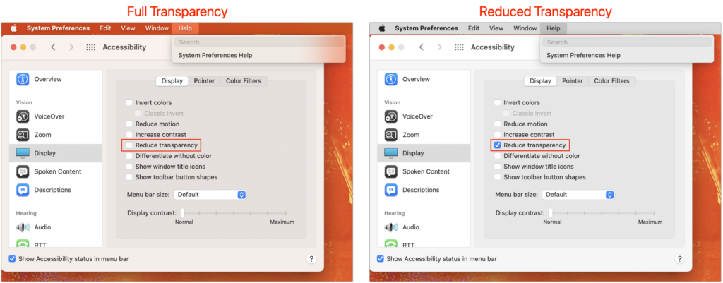
For years now, Apple has made transparency a part of the macOS interface, which has the effect of blending the menu bar into the background and making menus and some windows take on the background hue, as you can see on the left side of the illustration below. For many people, transparency blurs the interface, making it harder to differentiate interface elements from the wallpaper. It also causes problems for screenshots meant for publication because the images end up with unrepresentative color levels. To prevent that from happening, open System Preferences > Accessibility > Display and select Reduce Transparency. It can be a significant difference, as you can see on the right side of the illustration below.
(Featured image by Adam Engst)

A week might be too short if IT approval is still pending. I'd treat "keeping your old iPhone for a…
Awesome tech breakdown on "When Should You Upgrade to macOS 27 Golden Gate, iOS 27, iPadOS 27, watchOS 27, tvOS…
I’ve used Chrome’s built-in screenshot tool, but opening DevTools every time gets a bit tedious. I recommend FullPage Capture, it’s…
This is such an important reminder. I've been in meetings where an AI notetaker silently joined and recorded everything, and…
Awesome tech breakdown on "When Should You Upgrade to macOS 27 Golden Gate, iOS 27, iPadOS 27, watchOS 27, tvOS…