
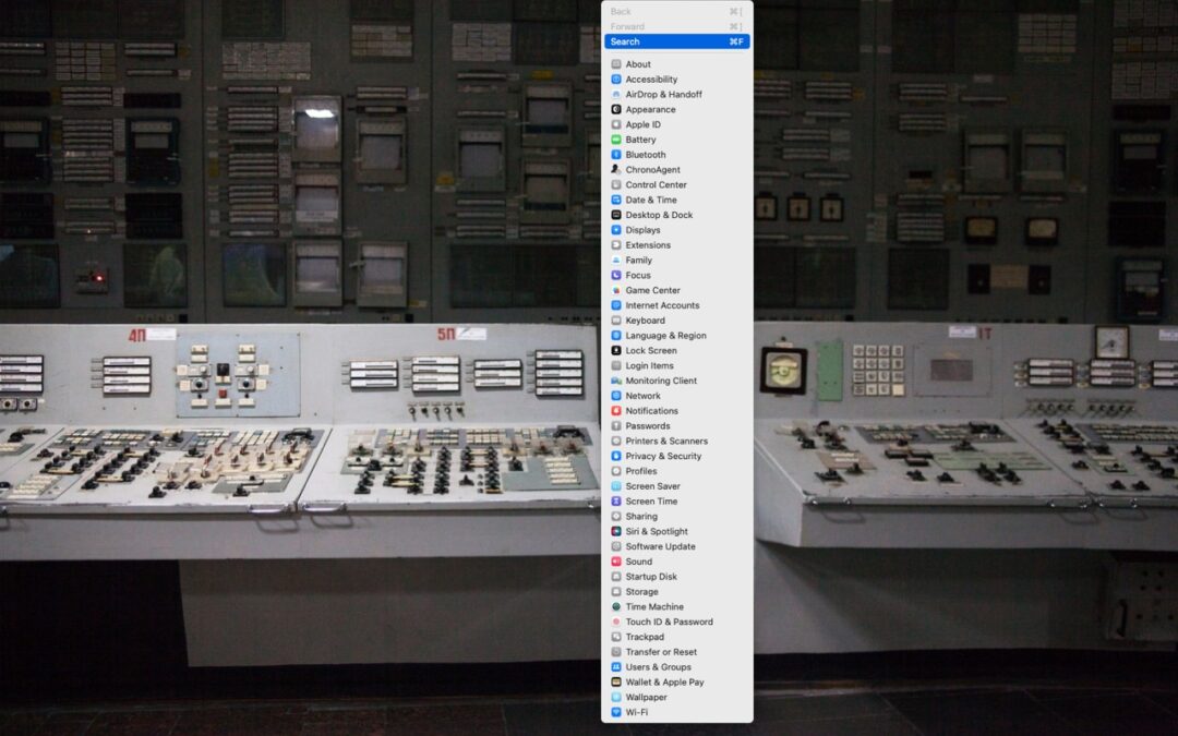
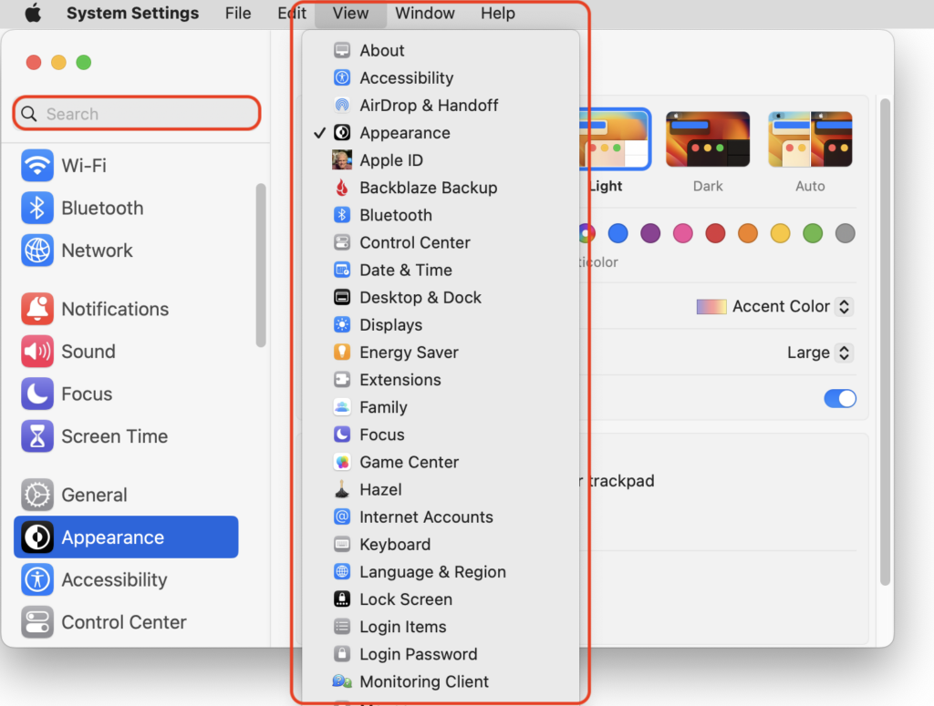
In macOS 13 Ventura, Apple replaced the creaky System Preferences with System Settings, which uses a more iOS-like interface. Some of our customers are finding System Settings overwhelming, partly because they had memorized where to look in System Preferences (but System Settings has many other design flaws as well—it’s not their fault). We have two recommendations to make it more easily navigable. First, for an alphabetical approach, use the View menu, which lists the panes that way, along with the top-level items in the General settings pane. Second, make heavy use of the search field at the top of the System Settings sidebar—it’s the only way to find some deeply nested settings.
(Featured image based on an original by iStock.com/rootstocks)

A week might be too short if IT approval is still pending. I'd treat "keeping your old iPhone for a…
Awesome tech breakdown on "When Should You Upgrade to macOS 27 Golden Gate, iOS 27, iPadOS 27, watchOS 27, tvOS…
I’ve used Chrome’s built-in screenshot tool, but opening DevTools every time gets a bit tedious. I recommend FullPage Capture, it’s…
This is such an important reminder. I've been in meetings where an AI notetaker silently joined and recorded everything, and…
Awesome tech breakdown on "When Should You Upgrade to macOS 27 Golden Gate, iOS 27, iPadOS 27, watchOS 27, tvOS…